Astronomy is one of the most visually engaging sciences, and as scientists we regularly share our work through graphs and interactive data visualizations. Look at any press release or article about our research and you’ll find cool graphics or stunning photos of the cosmos.
A picture is worth 1000 words.
Every month I watch our students and staff presenting their work to our community at our All Hands meeting. 3D graphics, elegant illustrations, animations, videos… their artistry and creativity is top notch, and helps tell the story of our science to the world. That’s why I’ve created this new monthly award, to regularly recognize and celebrate the work going on at DiRAC, and to share what I think are some of the best examples of the art (and science) of data visualization.
Winners each month will receive a small gift card from the Director, and the traveling Plot of the Month trophy. We will share their work here each month, so check back regularly to see our newest winners!
-Jim Davenport, DiRAC Director
October 2026
Our Awardee this month is Elliott Burdett. Here is the winning submission:
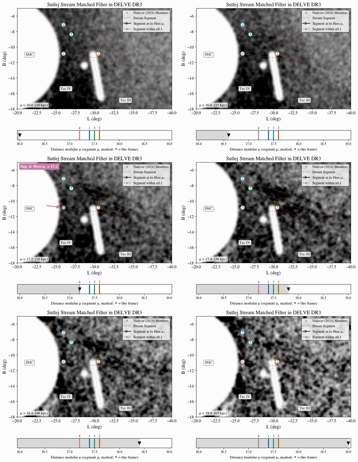
Description: This animation shows the detection of stellar streams at different distances from Earth from a “matched filter” analysis of data from the DELVE survey. Four faint segments of the Sutlej stellar stream (labeled lines) are revealed near the Small Magellanic Cloud